For some time, I’ve been meaning to play with web friendly mapping and visualization tools such as d3.js, datamaps.js or crosslet.js. D3 is quickly becoming the defacto standard for displaying statistical visualizations on the web, and other libraries are hooking in to add additional capabilities, like mapping. Communicating data effectively is the future, if not right now, and being able to get that data on to the web efficiently is a valuable skill.
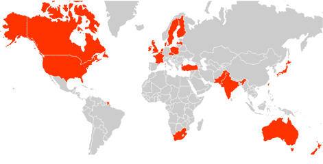
Like all skills, you need experience, and as a beginner it’s often best to dive in and muck around. It’s helpful, too, to have a purpose, or an itch to scratch when playing around with new tools. In my case, I wanted to create a map of countries that produce whisk(e)y.
First, I needed which countries produced whiskey. There’s no real definitive list, thus I used a composite of sources. And by produce, I mean distill. Also, I may have missed some countries or left them off if I could not corroborate what info I did find. Note, Scotland, Wales, England are part of the United Kingdom.
Next, I chose datamaps.js as my mapping tool. It looked straight forward and minimal. Tweaking a few settings, I set the default map color to grey and whiskey producing countries to red. To tell the tool to flag countries, you use an international three letter abbreviation and assign it an attribute. For example, here’s the designation for Australia:
AUS: {

      fillKey: 'MAKES'

}
Datamaps.js can also add other contextual information in its rollover of a country. Say you know how many distilleries there are for a country, you can add an additional property.
Below is a screenshot of the map. Click here to view the map of whiskey producers in the world.