On June 18th, the Fort Worth Mayoral run off will be held between Betsy Price and Jim Lane. Through out the entire campaign, their respective signs stood along roadsides and street corners. Regardless of where they fall on the political spectrum, their signage is interesting as well as signage for the other candidates. Below are some thoughts on the designs of all 5 Fort Worth Mayoral candidates, in order of least to most popular vote percentage from the May 14th election. All images found via Google Image’s cache and copyright their respective owners. I have no affiliation with any candidate.
Nicholas Zebrun
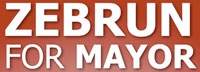
All during the campaign, I never once saw this sign. I recall seeing a blue and white sign with some sort of stylized star, nor can I track down any images of the sign I’m thinking of. This design is high contrast sans serif type face, white against red. Zebrun and mayor are weighted, made bold, for impact and visibility. The drop shadow gives the type depth. Aside from the red and white contrast, nothing stands out, nor would I think this to be memorable.
Dan Barrett

Again, we see the high contrast, eye catching red and white design. Barrett has several other things going on. His first name is skewed, albeit disproportionately to his last name. The last name, is skewed in such a way that it gives a sense of perspective–alluding to a path, or a way, or he has perspective on the issues? The skewing, renders the sign, “Dan B”. The tagline, “A New Way for Fort Worth”, is placed in the additional empty space, made by the distortion of his last name. Also, the alignment of the text needs work–Dan and Barrett should be better aligned, as does the tagline. Unless this sign is large, it’s not very readable.
Cathy Hirt
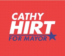
Cathy Hirt’s sign is visually interesting and appealing. Good typography–alignment and weighting of text, plus, the “for mayor” and the star flourish make this attractive. “Hirt” is dramatic and bold–definitely stands out, and the “for mayor” is interesting enough that the brain will make the connection. This sign will work for print and posters. Two concerns, however, are that the blue could be hard to read in passing or if the person was colorblind.
Jim Lane

Jim Lane’s sign is the first to break away from the red and white sans serif design. The other candidates up to this point emphasized their last names. Lane uses the brevity of his seven letters to an advantage–JIM LANE, in a distinctive typeface. The “FOR MAYOR” contrasts well between his name and the longhorn. The longhorn. It’s very similar, if not the same as the City of Fort Worth’s logo, except in a different color. Does it help? Yes. Take it away, and the sign is generic. With the longhorn, it’s an image associated with anything Fort Worth–so much that it could easily blend in with all the other Fort Worth signage as Yet Another Fort Worth Sign.
Betsy Price
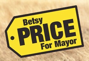
Betsy Price has luck from her namesake to help with a clever, interesting and playful design in that of a “Price” tag. The design is shaped uniquely with high contrast black sans serif text on a yellow background. It’ll work large and small. The similarity to the Best Buy logo is uncanny–and will definitely catch people’s attention. Price’s use of an already existing visual works, whereas Lane’s does not.
Conclusion
High contrast, clean design, visually appealing and, if you can pull it off, add something unique. Plus, use the roadside test. Can you see, and remember, the sign in the brief moments someone may take to look at it? If you can only afford small signs, they better be clear and distinctive.